


2026 COLOR & DESIGN TRENDS
This forecast offers a full-spectrum view of where design is headed. In it, we discuss four distinct themes brought to life through directional palettes, material choices, and interior applications across both residential and commercial spaces. Built for architects and designers, this forecast blends inspiration with strategy—so you can create with more clarity, creativity, and confidence in the year ahead.
.jpg)
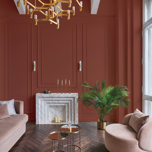
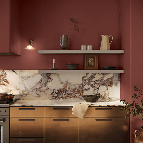
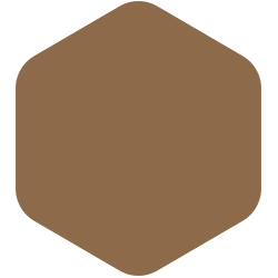
2026 Color of the Year Warm Mahogany
A rich, grounded red that’s bold enough to draw immediate attention and reserved enough to make a timeless statement.

.jpg)

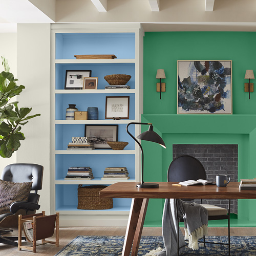
2026 Color & Design TrendPortal
This palette is most impactful when layered with intention—striking a balance between dreamy and grounded, without overwhelming the senses. Lively accents are used sparingly, bringing bursts of energy, while grounding and neutral tones provide structure and support. The softening accents speak to wellness and restoration, offering a quiet counterbalance that complements both commercial and residential settings.


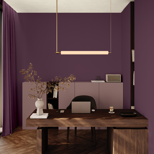
2026 Color & Design TrendOde
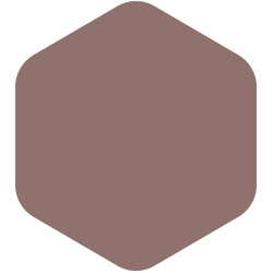
This palette is a blend of jewel-toned opulence and subtle mineral touches. The energy is poetic and romantic—as if the hues themselves are storied and artfully aged. Stone neutrals bring clarity and balance, helping to ground the palette. These colors thrive in residential settings and add subtle drama and intimacy to commercial environments.
.jpg)


_1.jpg)
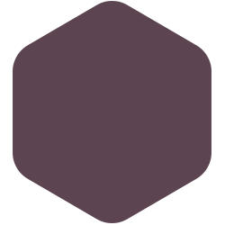
2026 Color & Design Trend Collective
This palette is layered and expressive, an abundant mix of dramatic shades, lively brights, and pastoral neutrals that are decadent and celebratory. Dramatic shades ground the palette with sophistication, while lively brights inject bursts of energy—best used sparingly in residential spaces or boldly in commercial environments. Pastoral neutrals soften the contrast, offering balance.


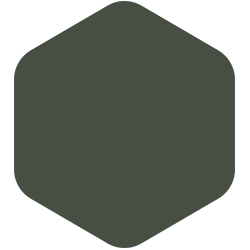
2026 Color & Design Trend Heirloom
This palette is rooted in tradition and timelessness. The heritage hues recall academic interiors, historic brownstones, and library stacks, evoking a sense of familiarity and refinement. Timeless neutrals offer stability and balance, providing a backdrop for layering textures and materials. Meanwhile, the bolder hues act as deliberate accents—best used sparingly in residential spaces to inject energy into distinguished environments or more expansively in commercial settings.

.jpg)
.jpg)