




Regional Paint Color Collections
Find beauty in your backyard or vacation spot

Get inspired by traditional paint color palettes from your own neighborhood or bring back the colors of a memorable locale where you traveled. Looking to geographic influences can be a meaningful way to redesign a room or jumpstart a new project.
Check Out Each Region:
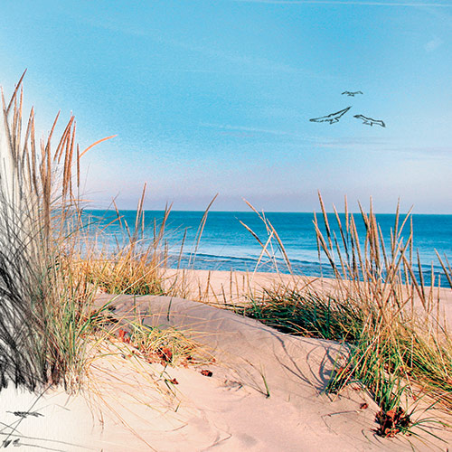
Up North
From the lake to the beach to the vineyards, these quiet, reminiscent colors will conjure memories for its residents and for those who have visited and have fallen in love with the beauty up north.























Nova Scotia
This regional paint color collection features the life of spring, the energy of summer, the abundance of fall and the clarity of winter all in one collection.
*Fallingwater is a registered trademark of the Western Pennsylvania Conservancy.

















































New England
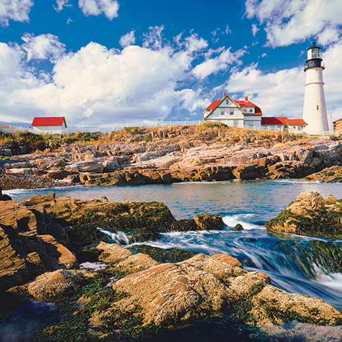
Whether you're looking to evoke the feeling of Nantucket or recall the splendor of a lighthouse on a rocky cliff, New England abounds with rich, authentic colors that harbor back to colonial times
*Fallingwater is a registered trademark of the Western Pennsylvania Conservancy.





























Nashville
From its fertile home nestled along the Cumberland River and its Southern heritage to the down-home vibe of Music Row and the Grand Ole Opry, this paint color palette reflects all that is Nashville.
*Fallingwater is a registered trademark of the Western Pennsylvania Conservancy.



















































Heartland
From British Columbia and Whistler to the prairies, our coordinated palettes pull from the landscapes across Western Canada and resonate with its unique geography. Escape there by adding these colors to your walls. The meaningfulness of cementing a particular color to a scene or memory of a space adds to the vision you create in your home.



































Charleston
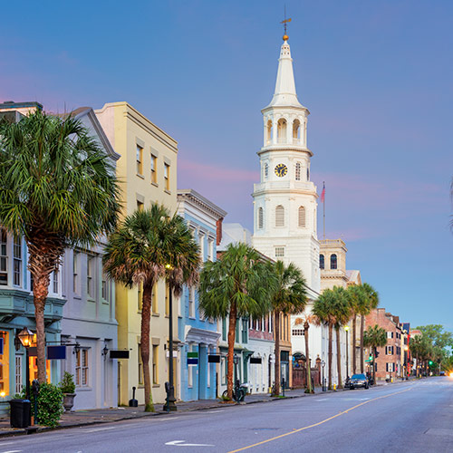
With more than 4,000 historic homes and architectural landmarks, Charleston has inspired this palette of historically significant colors. Color trends of the past featured bold colors on the interiors as well as the exteriors. The combination of brilliant woodwork and vibrant walls brought rooms alive.




































Caribbean
Choose from this breathtaking paint color collection representing the gorgeous sandy beaches and panoramic views of the islands to bring the relaxing vibe of life in the Caribbean home with you.


















Baja
From the warm sandy beaches and The Sea of Cortez to the enchanting La Rumorosa or the Sierra de Juarez, our harmonized paint color palette brings the gorgeous tones of the Baja region together.











































Atlantic
Three dozen, hand-picked paint colors express the warmth and relaxed mood of coastal living. Each color can work as a stand-alone choice or in combination for the interior or exterior of a home.













Alaska
Let Alaska's vibrant life and landscapes provide inspiration for your next painting project. The region's paint colors are balanced by the soothing neutrals of mountain grays, rocky riverbeds, soft snow and earthy soil.